Statistics and Finalizing the Final Output
Our Statistical Analysis of Registration Data
As we promised in the last blog entry, we developed a thorough statistical analysis of the course registration data heavily based upon visual representations. Our statistical analysis included topics such as spider-web based histograms, mean, standard deviation, and p-values.
Spider-Web Analysis
We implemented the spider-web diagram to show the average number of classes in each subject category students of different majors took. Overall, it is a fancy histogram that visually represents data with methods such as below.
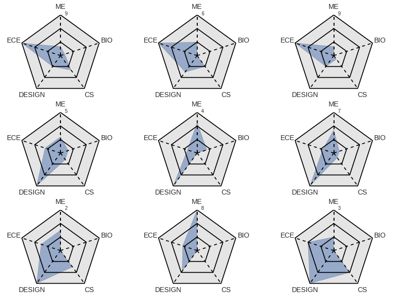
The major advantage to having a spider diagram is that visual comparisons of how students in each majors took different subject classes become very easy. Each shape symbolizes a major, and a student can easily identify with a major, and either choose to intentionally follow the average trend, or go against it, depending on their preferences.
In the figure below, we can see the average spider plots for students in each major. Unsurprisingly, students in a particular major program tend to have enrolled in a greater number of classes related to their field of interest. One unexpected trend is that Bioengineering majors take a high number of design classes.
Mean and Standard Deviation
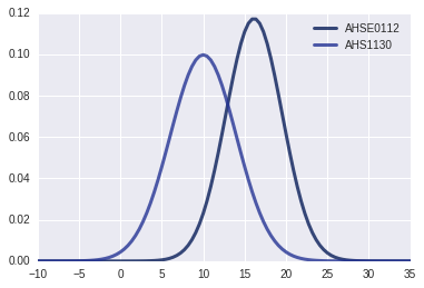
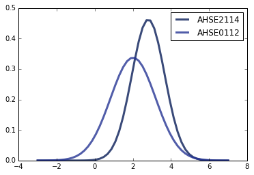
The mean and standard deviation of data are a staple in statistics. For the Olin student course registration dataset, we found the mean and standard deviation for two different scenarios: the number of students in each course, and the ‘year’ the student was when taking the course.
Taking the mean and standard deviation of the number of students in each course will aid in the students compare such values for different classes once graphically visualized. Students may smaller classes in the case of wanting a more engaging professor-student interaction, while larger classes can offer more student discussion. Students can now know which classes offer which as they make their choice, as shown with the graph below.
The mean and standard deviation of the ‘year’ (or grade) students took courses may offer additional insight especially useful for course selection. By observing the mean year, students can know which year the majority of students take a certain class, and if the student has a good chance in receiving a spot in the class in their current year. The standard deviation offers information on how diverse different classes are in terms of ‘year,’ particularly useful for students seeking such experiences.
Biased PMF
At Olin College, students often receive the majority of information and advice through word of mouth. However, such rumors over-represent certain classes and under-represent others, as shown by the graph below.
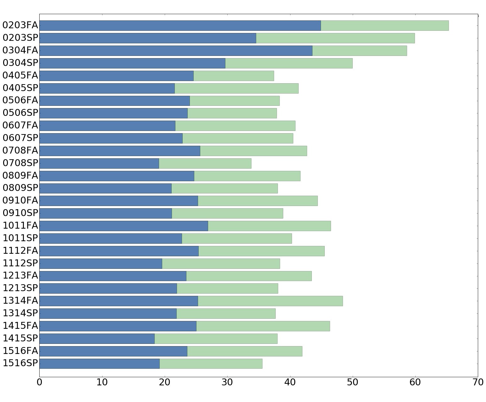
Below we look through every semester since the beginning of Olin. The green bar represents what the average course size of Olin is from the point of view of students, while the blue bar represents the actual average course size at Olin. This bias occurs as more students take courses with more people (obviously) and therefore there is a redundance in count, causing a perceived larger average course size at Olin.
Major p-value
The p-value of a dataset is often used for determining whether or not an an event occurred by chance given that a null hypothesis is true. The null hypothesis is a conservative hypothesis about a data set. For example, we ran a p-value test with our course registration dataset, where we observed the relationship between a student’s major and the likelihood of the student taking a course.
In this case, the null hypothesis is that there are no relationships between student majors and the courses taken. We then analyzed the trend of courses taken by students of the ECE major and computed the p-value for a few set of courses, as the bar graph shows below.
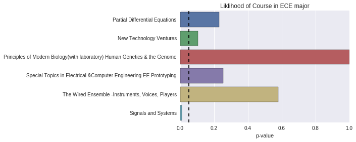
The bar graph shows that given the null hypothesis (no relation between courses and major) are true, the odds of an ECE major student taking such courses are as such. In a way, the graph makes a lot of sense, as required ECE courses such as Signals and Systems have an exceedingly low p-value. This information can help students identify what courses must be taken during their years at Olin. On the other hand, some classes with slightly higher p-values may indicate that those classes are not required, but are preferred for ECEs as they may offer great complementary knowledge and skills.
Decision on Final Output
After the plethora of statistical analysis we performed, we figured that creating a tool where the user/student is given such statistical information will be most useful. Although we initially wanted to gear towards a lot of machine learning and a course recommendation system, given the very change and evolution based aspects of the Olin curriculum, we believed that such a tool will be outdated very quickly.
The decision our team has to make now regards the medium of presentation. Currently, we are leaning towards developing a web tool, based upon D3. However, privacy and accessibility of the student registration data is still an issue, and we will have to encrypt, or creatively manipulate the system in order to maintain both privacy and usefulness of the tool.